Club Logo: Calling all budding/closet artists!
- Thread starter Temujin
- Start date
- Replies 29
- Views 7K
-
See what others are reading now! Try Forums > Current Activity
You are using an out of date browser. It may not display this or other websites correctly.
You should upgrade or use an alternative browser.
You should upgrade or use an alternative browser.
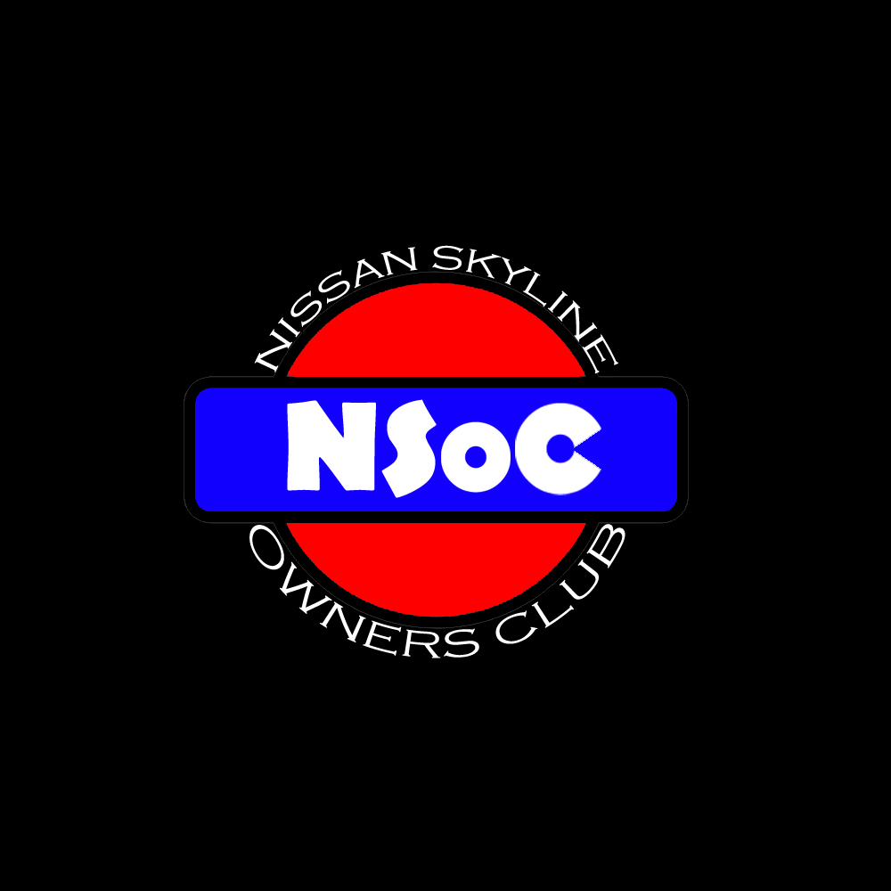
trying my luck. I start the design with old Nissan Logo since I like old stuff and Skyline is known long time ago and the fact that Hakosuka and Ken&Meri skyline are old but so precious, I chose to start with old logo instead of new.
I chose not to alter the base color but instead make it brighter to get the newer/modern look. and the Blue can also be described as color of unity. when i was in primary school I learn that biru is perpaduan :P
the 'N' and 'S' in the middle of the logo stands for Nissan and Skyline, the base of this club while the 'O' and the 'C' stands for Owners Club, it is customized to symbolized the famous rounded tail light of skyline.
- Joined
- Sep 17, 2008
- Messages
- 20,674
- Points
- 1,713
Well, since everyone is trying to contribute, I guess I might as well join in the fun. 
Anyway, here it is, is a simple logo which I created. Well I did get a few feed backs from friends
and amended a few times after considering a few things.
So, below is the logo I design and not sure if you guys like it. To me, a logo should not be too
complicated and must be able to easily fit into most backgrounds without too many colours
in a logo. So, the only colour I use so far in these few attempts are just Black and 2 types
of reds (in the 2nd logo).
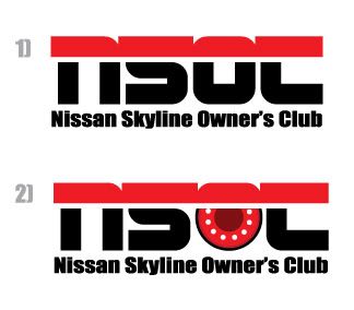
Basically, I chose a much more BOLD and kind of wordings so that it has a little bit more of
an impact on the logo and if it were to be created into an emblem, it will be just nice and simple
on a car. Myself, I prefer the 1st one though.
Well, is not much, hope it helps though. :top:
Anyway, here it is, is a simple logo which I created. Well I did get a few feed backs from friends
and amended a few times after considering a few things.
So, below is the logo I design and not sure if you guys like it. To me, a logo should not be too
complicated and must be able to easily fit into most backgrounds without too many colours
in a logo. So, the only colour I use so far in these few attempts are just Black and 2 types
of reds (in the 2nd logo).

Basically, I chose a much more BOLD and kind of wordings so that it has a little bit more of
an impact on the logo and if it were to be created into an emblem, it will be just nice and simple
on a car. Myself, I prefer the 1st one though.
Well, is not much, hope it helps though. :top:
taim fer mai kontribution.. 
1. I simply tiru TitanRev's idea.. lol.. thanks & sorry TR..
2. NISMO's silohuetee (damn..how to spell that?)
3. Simply put one.. pretty gud enuf me thinks..
I'll roll more if me got more time and ideas.. haha
cheers.

1. I simply tiru TitanRev's idea.. lol.. thanks & sorry TR..

2. NISMO's silohuetee (damn..how to spell that?)
3. Simply put one.. pretty gud enuf me thinks..
I'll roll more if me got more time and ideas.. haha

cheers.
Attachments
- Joined
- Oct 22, 2008
- Messages
- 442
- Points
- 1,518
- Joined
- May 21, 2004
- Messages
- 2,146
- Points
- 3,213
I like both of Farique's first and second designs as well as Lemon's effort as well.
However, bear in mind that the name NSOC has yet to be approved by the ROS (although the application requires a logo) and that the ROS requires an explanation for the design such as the use of colours, etc.
However, bear in mind that the name NSOC has yet to be approved by the ROS (although the application requires a logo) and that the ROS requires an explanation for the design such as the use of colours, etc.
My contribution...
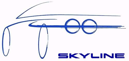

My contribution...

Isn't it look a bit like gtroc uk??
Similar threads
- Replies
- 17
- Views
- 5K
- Replies
- 57
- Views
- 7K
- Replies
- 203
- Views
- 25K
- Replies
- 3
- Views
- 2K
- Replies
- 19
- Views
- 4K
- Replies
- 4
- Views
- 3K
- Replies
- 4
- Views
- 5K
- Replies
- 69
- Views
- 22K
- Replies
- 7
- Views
- 2K
- Replies
- 0
- Views
- 2K
New Posts
- Replies
- 0
- Views
- 230
- Replies
- 0
- Views
- 231
- Replies
- 0
- Views
- 202
- Replies
- 0
- Views
- 290
The Marketplace Latest
Posts refresh every 5 minutes
https://www.zerotohundred.com/wp-content/uploads/2011/04/redbull-600x375.jpg
Red Bull Racing’s Sebastian Vettel won last week’s Formula One opening round at Australia by a massive margin and without the aid of KERS...
Red Bull Racing’s Sebastian Vettel won last week’s Formula One opening round at Australia by a massive margin and without the aid of KERS...
A new avenue to BMW vehicles has just opened in the north with Tian Siang Premium Auto at the Juru Autocity in Prai, bringing the premium carmaker’s total dealership count to 15 nationwide.
The new dealership will...
The new dealership will...
I don't know what to call this sound, but the term, I think, describes it best. Please click on the link, the description of the occurrence of the sound is perfect...
Recent Posts
-
Upping Wira 1.5 MMC performance
- Started by Nyfka
- Car Modification
-
AMPANG mari!!ZTH member
- Started by shahaff_07
- Groups and Meets
Search
Enjoying Zerotohundred?
Log-in for an ad-less experience

