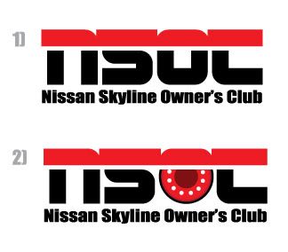
Well, since everyone is trying to contribute, I guess I might as well join in the fun.

Anyway, here it is, is a simple logo which I created. Well I did get a few feed backs from friends
and amended a few times after considering a few things.
So, below is the logo I design and not sure if you guys like it. To me, a logo should not be too
complicated and must be able to easily fit into most backgrounds without too many colours
in a logo. So, the only colour I use so far in these few attempts are just Black and 2 types
of reds
(in the 2nd logo).
Basically, I chose a much more
BOLD and kind of wordings so that it has a little bit more of
an impact on the logo and if it were to be created into an emblem, it will be just nice and simple
on a car. Myself, I prefer the 1st one though.
Well, is not much, hope it helps though. :top:


 just my 2 cents..jgn mare bro..